Sunday, September 26, 2010

Sneak Peek!

DSCN0721

I've been working on the layout for a very special quilt today.  Since I don't have a design wall in this teeny tiny apartment, I stripped all the sheets off my bed and used the bare mattress as the design wall.  The nightstand worked perfectly as a prep table for my cut patches.

The fabrics are Carolina Chambrays from Robert Kaufman.  They are a pain to cut (the fabric never stays square!) but they look gorgeous.  All fabrics in this top will be chambrays with the exception of the sashing, which is the black Razzle Dazzle dot from Timeless Treasures.

Here's hoping I can work on this all week and finish up next weekend.  Then, I can send it out to the longarm quilter and get it back with plenty of time before Christmas.  Cross your fingers for me!

Monday, September 20, 2010

Modify Tradition

Finally!  I have completed my sampler quilt top from Modify Tradition Round 1.  This top sat in a drawer for quite a long time, ignored and forgotten, and-- dare I say-- unloved!

DSCN0720

I like it much more having seen it sewn together.  I didn't love my blocks from the first round-- I blame that one some of the fabric choices I made.  But, the money was spent, and starting over would be costly, so I continued with the original plan.

The quilt top is quite large-- 90"x90".  That is why the picture is so terrible; even Josh couldn't hold it up so I could see the whole thing.

I set my blocks in four rows of three, with wide horizontal sashing.  The rows alternate justification to the left and right and overlap just a bit in the middle.  Fabrics include some Robert Kaufman Carolina Chambrays; the background fabric, in particular, comes from this fabric line.

Thankfully, I have several 50% coupons from Joann's, and so I will be purchasing several yards of fabric and batting for this quilt.  I have decided to undertake the perilous task of quilting this myself.  It will be my largest self-quilted project to date.  We will see how that goes...

Saturday, September 18, 2010

Snail Trail

I finally mailed off all those old bee blocks!  Not old, really, just late.  Super, super, super late.  Some were late by several months.  I don't think I should ever participate in another bee, since I'm so bad at getting to the post office on time.

DSCN0715

These are a couple pictures of Lesly's block for September.  She sent the cutest red and aqua prints and asked us to make a Snail Trail block.  Looks kind of complicated, right?

DSCN0717

It was surprisingly easy to make, with the cutest four patch in the middle.  Basically, this block is made with the square in a square method-- you sew quarter-square and half-square triangles to the four patch in the middle, building the block out.  The alternation of solid and prints create the swirling effect.

I would have made Lesly an additional block with my extra triangles and fabric, but I realized that the second block would look exactly the same as the first.  In the interest of visual variety and scrappiness, I chose to save the squares for Lesly and allow her to make the remaining blocks.

Can't wait to see this quilt!

Friday, September 10, 2010

Digital Design

I've finally gotten EQ7 installed onto my Mactop!  That means I've begun designing a lot of different quilts.  Not many have gotten past the layout stage.  Some have gotten color.  Some have gotten out of control.

Which is what I'm here to talk to you about today.  Keep reading.

I've long been inspired by Cherry House and all of her beautiful quilts.  One of my particular favorites is Sliced Fruit.  This quilt is simple yet graphic, and has wonderful candy colors.  The following designs, though not my color choices, were heavily inspired by this quilt.

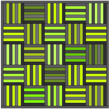
I knew immediately that my quilt would incorporate a variety of grey blender batiks, and so I chose I filled my blocks with a variety of grays from the color palette.  I then went straight for the greens so I could find my favorite shade of chartreuse.  A single shade seemed boring to me, so I tried several greens in a variety of tones and saturations.

1

The first rendition turned out too green.  I elected to eschew the greenest green and replace it with something more yellow in tone, and felt that the design had changed for the better.  At this point, the quilt top was not too green; it did, however, become decidedly masculine after that color change.  Not necessarily a bad thing, but not the look I was going for.  I had set out to create a gender neutral quilt design that I might use for coworkers or family members who are having babies.
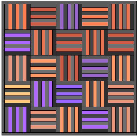
2

My girlfriend, Jessica noted that she felt the quilt would look great with soft purples.  Since EQ makes it so easy to tweak and save all the permutations of my quilt design, I went ahead and tried them.  Some of the purples were pinkish in feel, and some were blue, but they blended together to make a pretty, feminine quilt.  I thought the design was nice enough but it lacked drama!  Perhaps two colors would punch this up a bit.

3

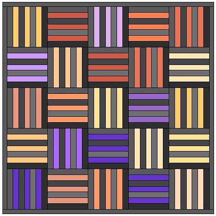
I thought it would be daring to blend the purples with orange, and so I began adding orange to the quilt top.  This is when things started to get exciting.  The two colors complemented each other so beautifully!  More importantly, this quilt top did not look like a festive Halloween decoration; to me, it looked exciting and different than anything I had ever seen in the online quilting world.

4

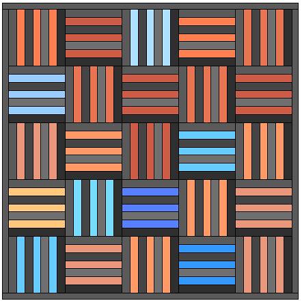
Speaking of the online quilting world... so many folks are loving orange and aqua right now, so I figured I should try my hand at designing with that color combination.  I chose some saturated shades of aqua, but used mostly pale shades, focusing on the relationship between dark and light.  What resulted was a fun, trendy quilt top with a simple design.

5

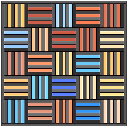
The orange and aqua were fine, by all standards, but I was still left wanting more.  I played with the oranges for quite some time, and found that the design was far more striking (to my eye) when I added yellow-orange to the mix.  The design became immediately more modern and pleasing to my eye.

6

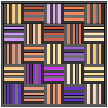
Because I loved the orange combinations from the previous design, I decided to test this particular orange palette with purple.  It was difficult to settle on the right balance of pink in my purples.  This design felt too pink.  I couldn't manage to work the pinkish-purples the way I wanted, and so I decided to move on and try other darker shades of purple.

7

The final rendition uses my favorite palette of oranges with darker, bluer purples.  The resulting design is reminiscent of a water color painting.  The contrast between the orange and purple is striking and elegant.

8

Because of the magic of EQ I was able to create several different designs in just about an hour.  What's great about the program is that I can save every single design into my worktable, and come back to it later.  That means I can go back to a previous design to use it as a springboard for a color or placement mutation.  Doing this allows me to make a zillion permutations of a single design, and I can view them all and decide which ones I like best.

It is so choice.  If you have the means, I highly recommend you pick one up.

Wednesday, September 8, 2010

DQS9 Reveal!

Been a long time.  Shouldn't have left you (without a dope beat to step to).

Seriously, though, it has been a long time.  I read all those posts about quilting without obligation, and I started to feel a little obligated myself.  So, I spent time doing the things I really wanted to do all summer long.  Things like go to the beach and watch baby sea turtles go out to the ocean, fly to Chicago, see my sister get married, take a class and grow professionally.  You know... me stuff.

Anyway, one of my quilting obligations from this summer was a swap quilt for the Doll Quilt Swap 9.  I participated in round 7 and received a beautiful quilt, and enjoyed my making experience, so I decided to go ahead and participate in round 9, too.

It turned out to be a big fat regret for me.  My partner was pretty silent for the most part.  She seemed nice enough, with similar taste to the rest of the blogging world, but her silence left something to be desired.  So many women were participating in discussion conversations, posting sneak peaks, and talking about favorite quilts in the pool.  I was hoping to observe from afar, see what she was making for her partner, and learn more about what she liked.  But, since she added only half a dozen pics to her flickr for the duration and virtually never blogged, not to mention made no comments in the flickr group, I felt that I didn't know anything about her.

I put off the making of the quilt for as long as possible, hoping to catch a glimpse of my partner around the internet.  No such luck.  So, I went ahead with the little direction I had.  My partner said that she liked "trendy" fabrics, so I chose a red and aqua color scheme, put the prints with white, and tried to make something cute.  It turned out cute, alright, but it's also fairly generic.

Polka Dotty

During the sewing process I became frustrated and disillusioned with this quilt.  I couldn't figure out how to properly use the blanket stitch on my machine, and couldn't even do raw-edge applique!  In the end I just left the circles fused to the background without any stitching holding them down.  Instead, I basted and quilted over the pieces, praying that the quilting stitches would be enough to hold the fused circles on.

Polka Dotty

I quilted a grid-- straight lines all one inch apart.  The quilt is backed in an awesome red print I bought about two years ago; I think it could be a Kaffe Fasset print, but who knows.  The binding is pieced with red solid and the same fabric as the backing (I think that is my favorite detail).  I failed to add a label with the swap information; it doesn't really matter now because it's already in the mail.

The pictures were taken while I was in line at the post office.  I think that shows exactly how I felt about this quilt.