I've finally gotten EQ7 installed onto my Mactop! That means I've begun designing a lot of different quilts. Not many have gotten past the layout stage. Some have gotten color. Some have gotten out of control.
Which is what I'm here to talk to you about today. Keep reading.
I've long been inspired by Cherry House and all of her beautiful quilts. One of my particular favorites is Sliced Fruit. This quilt is simple yet graphic, and has wonderful candy colors. The following designs, though not my color choices, were heavily inspired by this quilt.
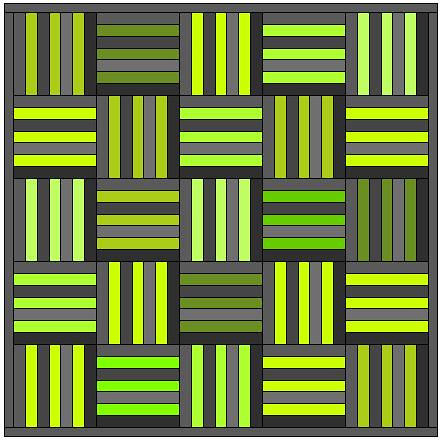
I knew immediately that my quilt would incorporate a variety of grey blender batiks, and so I chose I filled my blocks with a variety of grays from the color palette. I then went straight for the greens so I could find my favorite shade of chartreuse. A single shade seemed boring to me, so I tried several greens in a variety of tones and saturations.
The first rendition turned out too green. I elected to eschew the greenest green and replace it with something more yellow in tone, and felt that the design had changed for the better. At this point, the quilt top was not too green; it did, however, become decidedly masculine after that color change. Not necessarily a bad thing, but not the look I was going for. I had set out to create a gender neutral quilt design that I might use for coworkers or family members who are having babies.
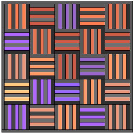
My girlfriend, Jessica noted that she felt the quilt would look great with soft purples. Since EQ makes it so easy to tweak and save all the permutations of my quilt design, I went ahead and tried them. Some of the purples were pinkish in feel, and some were blue, but they blended together to make a pretty, feminine quilt. I thought the design was nice enough but it lacked drama! Perhaps two colors would punch this up a bit.
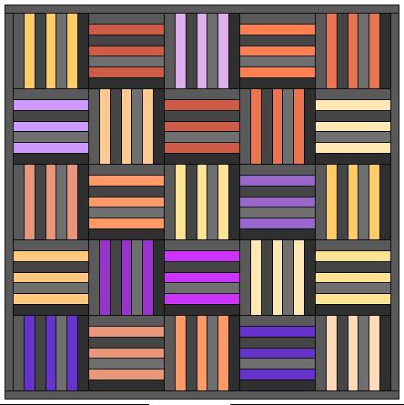
I thought it would be daring to blend the purples with orange, and so I began adding orange to the quilt top. This is when things started to get exciting. The two colors complemented each other so beautifully! More importantly, this quilt top did not look like a festive Halloween decoration; to me, it looked exciting and different than anything I had ever seen in the online quilting world.
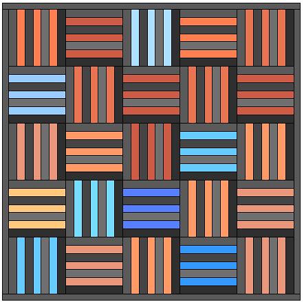
Speaking of the online quilting world... so many folks are loving orange and aqua right now, so I figured I should try my hand at designing with that color combination. I chose some saturated shades of aqua, but used mostly pale shades, focusing on the relationship between dark and light. What resulted was a fun, trendy quilt top with a simple design.
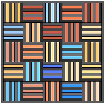
The orange and aqua were fine, by all standards, but I was still left wanting more. I played with the oranges for quite some time, and found that the design was far more striking (to my eye) when I added yellow-orange to the mix. The design became immediately more modern and pleasing to my eye.
Because I loved the orange combinations from the previous design, I decided to test this particular orange palette with purple. It was difficult to settle on the right balance of pink in my purples. This design felt too pink. I couldn't manage to work the pinkish-purples the way I wanted, and so I decided to move on and try other darker shades of purple.
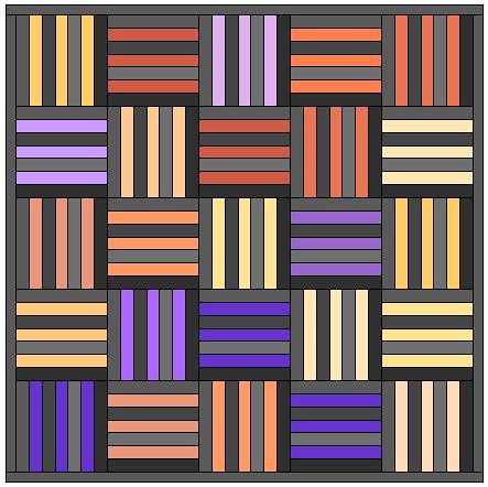
The final rendition uses my favorite palette of oranges with darker, bluer purples. The resulting design is reminiscent of a water color painting. The contrast between the orange and purple is striking and elegant.
Because of the magic of EQ I was able to create several different designs in just about an hour. What's great about the program is that I can save every single design into my worktable, and come back to it later. That means I can go back to a previous design to use it as a springboard for a color or placement mutation. Doing this allows me to make a zillion permutations of a single design, and I can view them all and decide which ones I like best.
It is so choice. If you have the means, I highly recommend you pick one up.


No comments:
Post a Comment