You know this commercial? It goes right along with my current quilting project-- both the concept and the person!
The colors for this project were supposed to be "rich" and "royal"-- the types of colors preferred by the recipient. I chose the Carolina Chambrays by Robert Kaufman because they have such a rich quality to them. The iridescent shimmer created by the cross-woven fibers, the silky-smooth texture, and the jewel-toned colors all scream expensive without actually being that expensive. ("Opulence, I has it. But I also like savings the money...")
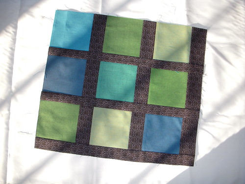
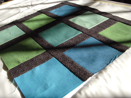
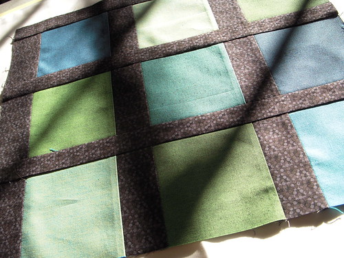
Here are some sneak peek photos of one of the first blocks I've made for the completed quilt. My layout inspiration for this project comes from Cherri House's quilt City Green. The pattern is published in Cherri House's new book, City Quilts.
In order to keep track of which squares belong where, I have devised an ingenious labeling system. Because my layout is 18x18 squares, I decided to sew my patches together into blocks of 9 squares-- how easy! Each row on the y-axis was labeled with a number 1-18. The x-axis was a bit more complicated. I lettered the patches in threes-- the first three were "A," the next "B," and so on. This way, when I stacked my squares, I knew that row A1 was to be the first three blocks on the first row of the quilt. Row B1 would be the next three blocks in the first row. A2 and B2 would be the three blocks directly below A1 and B1. To get my first block, I would have to sew A1-3 together-- 9 patches in all. Make sense?
Anyway, it's coming together nicely, and I better get off blogger and onto the machine. I have to drop everything off for the quilter to pick it up Oct 8-- that's Friday, in case you were wondering. Quilt top sweat shop here I come!


No comments:
Post a Comment